A visitor lands on your page with one question in mind: can this business solve my problem without wasting my time? That is the real job of service business landing pages. Not to impress other marketers. Not to show off every feature of your company. Just to move the right person from interest to action.
That sounds simple, but most service pages still miss. They lead with vague claims, bury the offer, and ask people to work too hard to figure out what happens next. If you run a local service, consulting offer, agency, practice, or appointment-based business, your landing page needs to do less and do it better.
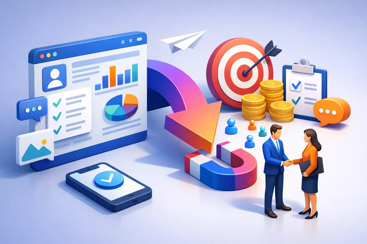
What service business landing pages need to do
A good landing page is not a smaller homepage. It is a focused sales page with one outcome. Book a call. Request a quote. Schedule an appointment. Start a registration. Claim an estimate. The more actions you offer, the weaker the page usually gets.
Service businesses have a specific challenge here. You are not selling a product someone can inspect in a few seconds. You are selling trust, speed, expertise, and clarity. People want to know what you do, who it is for, whether you are credible, and how to get started. If any of those answers are unclear, conversion drops.
This is why high-performing service business landing pages are usually narrower than business owners expect. They do not try to explain everything about the company. They focus on one service, one audience, or one campaign. A family dentist should not send cosmetic dentistry ad traffic to a generic practice homepage. A law firm should not send personal injury leads to a page that also talks about estate planning and business law. A consultant should not pitch strategy, operations, coaching, and speaking on the same page unless the goal is pure confusion.
Start with the offer, not the business history
Visitors care about their problem first. Your page should meet that immediately.
The headline needs to say what you do and who it is for in plain English. Not clever copy. Not broad positioning language. If you offer bookkeeping for small ecommerce brands, say that. If you provide emergency plumbing in Phoenix, say that. If you help founders prepare investor decks, say that.
The subheading should reduce friction. Explain what result the customer gets, how fast the process is, or what makes your service easier to buy. This is where specificity matters. Faster response times, fixed pricing, same-week appointments, or a free consultation all help when they are real.
Then bring the call to action into view early. If someone is ready now, do not make them scroll through your origin story first.
The core sections that actually matter
Most service business landing pages do well with a compact structure. The exact order can change, but the essentials stay the same.
First, clarify the service. State what you offer, where you offer it if geography matters, and what type of customer should contact you. This pre-qualifies traffic and saves time on both sides.
Next, show the outcome. Service buyers think in terms of relief and progress. They want cleaner books, faster legal help, a booked-out event, a repaired HVAC system, or a better-performing campaign. Write to that outcome, not just the process.
After that, build trust. This can come from testimonials, review snippets, certifications, years in business, client logos, before-and-after results, or a short explanation of your process. The right trust signal depends on the service. A med spa page may benefit from visual proof and review language. A law firm page may need credentials and case-related credibility. A B2B consultant may need clear results and recognizable client types.
Then make the next step obvious. If your page asks people to book, the booking action should feel low friction. If your sales process starts with a quote request, the form should ask only what you truly need. If your service is urgent, put response expectations on the page. "We reply within one business day" is stronger than a generic contact button.
Why clutter kills conversion
A lot of pages underperform for one reason: they are carrying too many jobs at once.
If your landing page is trying to rank in search, explain every service, tell your brand story, recruit talent, and collect leads from multiple audience segments, the page will feel slow even if it loads fast. Visitors should not have to interpret your business model before they can contact you.
This is where restraint wins. Cut long paragraphs that repeat obvious claims. Cut stock phrases like "committed to excellence" unless you can prove them. Cut navigation options if the page is campaign-driven and you want focused action. Cut form fields that create hesitation. Every extra decision gives people a clean excuse to leave.
Simple does not mean thin. It means intentional.
Writing copy that sounds credible
Service businesses often swing between two weak extremes. One is dry and generic. The other is inflated and sales-heavy. Neither works well.
The better approach is direct confidence. State the service. State the audience. State the value. Then support it with proof.
Good copy sounds like a business that knows what it does. For example, "Tax planning for self-employed professionals who want fewer surprises at filing time" is stronger than "Comprehensive financial excellence tailored to your journey." One sounds buyable. The other sounds autogenerated.
Clarity also lowers anxiety. If your process is easy, say how it works in two or three steps. If pricing is straightforward, signal that. If turnaround time is a selling point, put it on the page. Service buyers are often comparing not just quality, but effort. The business that feels easiest to work with has an edge.
Design choices that support action
A landing page does not need heavy design to perform well. It needs visual hierarchy.
The first screen should answer three questions fast: what is this, who is it for, and what should I do next? That means a clear headline, short supporting copy, and a primary call to action that stands out.
From there, spacing matters more than decoration. Dense sections make service pages feel harder than the service itself. Break content into scannable blocks. Use concise section headings. Keep forms short. Make buttons specific. "Book a consultation" is better than "Submit." "Get a free estimate" is better than "Learn more" when the user is already on the page.
Mobile deserves extra attention. Many local and service searches happen on a phone, often when the need is immediate. If your page forces users to pinch, scroll through oversized banners, or fight a clumsy form, conversion will suffer. Fast-loading pages, tap-friendly buttons, and simple layouts do more work than flashy effects.
One page per service is usually the smarter move
If you offer multiple services, it is tempting to fit them all onto one page. Sometimes that works for a very small business with a simple sales process. Most of the time, separate pages perform better.
That is because search intent and buyer intent are usually more specific than your service menu. Someone looking for wedding photography is not looking for a general creative studio. Someone searching for business litigation help does not want to sort through ten unrelated legal services. Someone needing event registration support wants that solution now, not a broad agency pitch.
Focused pages also make testing easier. You can change the headline, offer, CTA, proof, or layout for one service without disrupting everything else. This is especially useful for paid campaigns and seasonal offers where speed matters.
For teams that do not want a long build cycle, AI-generated workflows can remove a lot of that setup friction. Instead of starting from a blank canvas or forcing a generic template into shape, you can describe the page you need, generate a solid first draft fast, and refine sections from there. That is part of the appeal behind tools like DevOpser Lite. The speed is useful, but the bigger advantage is momentum. You launch while the opportunity is still current.
What to test on service business landing pages
If a page is getting traffic but not enough leads, the issue is often not dramatic. It is usually one of a few practical mismatches.
Your headline may be too broad. Your CTA may ask for too much commitment too early. Your proof may not match the service being sold. Your form may be longer than the buyer thinks the interaction is worth. Or your page may attract one audience while speaking to another.
Start with the parts closest to the conversion decision. Test the headline, subheading, CTA language, form length, and the trust section nearest the action. If you run ads, make sure the landing page language mirrors the promise that got the click. Message match is not a small detail. It shapes whether visitors feel they landed in the right place.
It also helps to watch for qualification problems. A page can convert poorly because it is weak, but it can also convert poorly because it is attracting the wrong traffic. Better targeting and tighter copy often improve lead quality as much as raw volume.
The best service business landing pages feel easy to say yes to. They remove doubt, shorten the path, and respect the visitor's time. If your page does that, you do not need more complexity. You need more of the right traffic and a faster way to keep shipping improvements.